This really nice technique for creating a full width image inside a constrained column was being shared around recently. However, what it didn’t do was explain why this technique works. As part of my attempt to remove all the “it just works magic” from these techniques I thought I would explain.
I’ll write more about naming when I get to that part of my series explaining the Grid Spec, however understanding this technique requires the understanding of a few things about Grid.
We can position things against lines of the grid
If you have used grid at all you are probably familiar with the concept of positioning items based on line numbers. We can achieve the breakout layout using this line-based placement of items. When we create a three column grid, as in the image below, we get 4 numbered lines. The breakout item is positioned from line 1 to line 4, the content from line 2 to 3. You can also see this in a CodePen.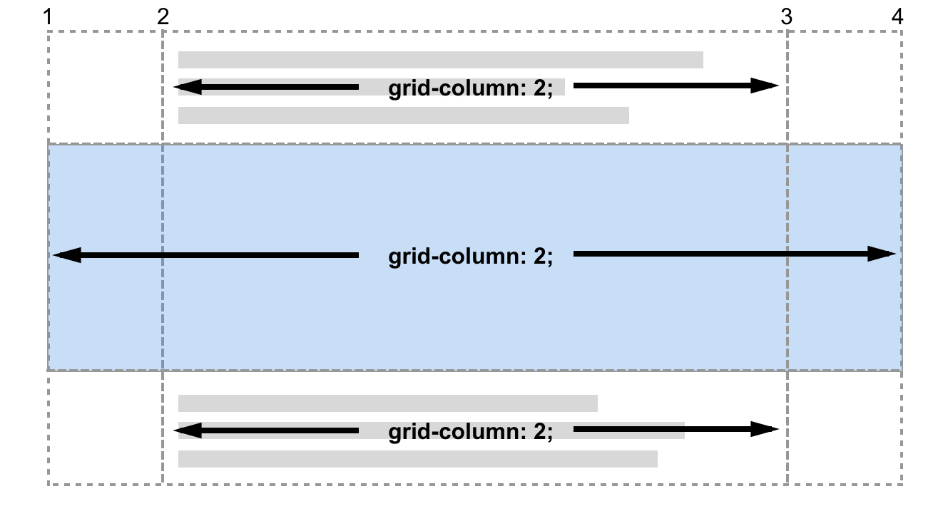
However the example tutorial doesn’t use line numbers at all. It’s neater than that and doesn’t require that you understand what number lines on the grid are.
You can name lines
You need to know that you can name lines. In my next example the lines are named, I replace numbers with names to place items on the grid. Also demonstrated on CodePen. 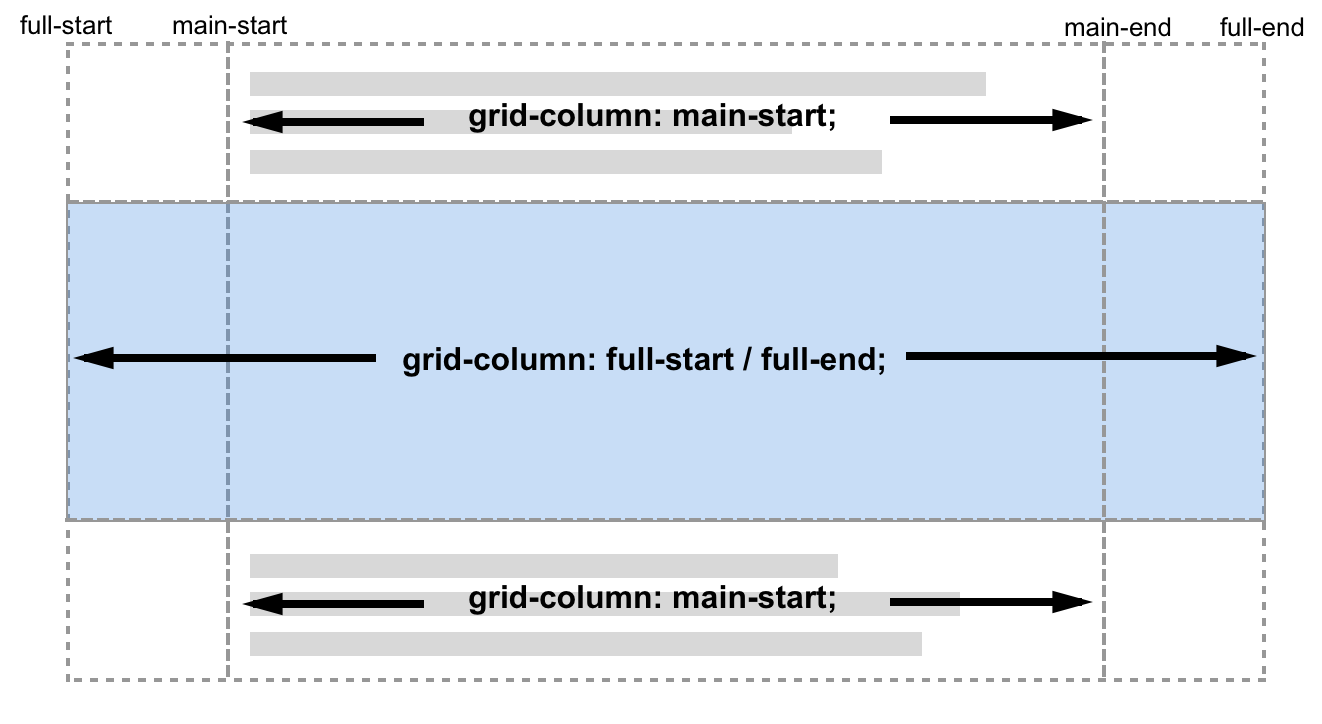
Is this example, as with the referenced tutorial, I have named my lines *-start and *-end. This is important for the technique. Naming lines is optional as the article suggests, but the technique as described wouldn’t work without named lines.
When you name lines, you can optionally name them as *-start and *-end and this gives you a little more grid magic. We get a named grid area of the main name used. Sounds odd? Take a look at the diagram below, it shows 4 named grid lines, main-start and main-end both for columns and rows. The area marked out by the intersection of these lines can now be referenced by the name main. If we had named the lines foo-start and foo-end then we would have a named area called foo.
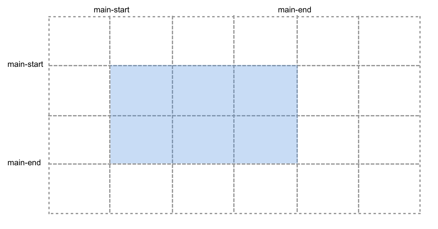
However this doesn’t get us to the technique used, which doesn’t used the named area, it is positioning against lines named ‘main’ and ‘full’ which are not defined anywhere.
We have lines named main-start and main-end for our columns, therefore a named area called main. We also have lines named main that can be used for start due to the following note in the specification for line-placement:
“Note: Named grid areas automatically generate implicit named lines of this form, so specifying grid-row-start: foo will choose the start edge of that named grid area (unless another line named foo-start was explicitly specified before it).”
This means that we can set grid-column-start to main and Grid will position that item at the start edge of the area that is named main due to us having named grid lines of main-start and main-end.
What of the end line? In the tutorial the item is positioned with grid-column: main.
The final piece of the puzzle is that if the start line is a named ident (which ours is) and the end line is missing, then the end line is set to the same named ident. In the specification for placement shorthands we can read:
“[when using grid-row and grid-column shorthands] … When the second value is omitted, if the first value is a <custom-ident>, the grid-row-end/grid-column-end longhand is also set to that <custom-ident>; otherwise, it is set to auto.”
This gives us a grid-column-end of main which will give us the end edge of the area called main thus our item stretches right across the grid covering all the column tracks between main-start and main-end.
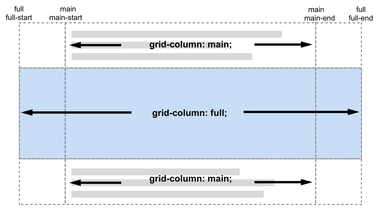
You can see this in DevTools if you inspect the element grid-column-start and grid-column-end is main for the elements constrained by the column and full for elements constrained by the full width breakout. This is shown in the below screenshot of this CodePen of the completed example.
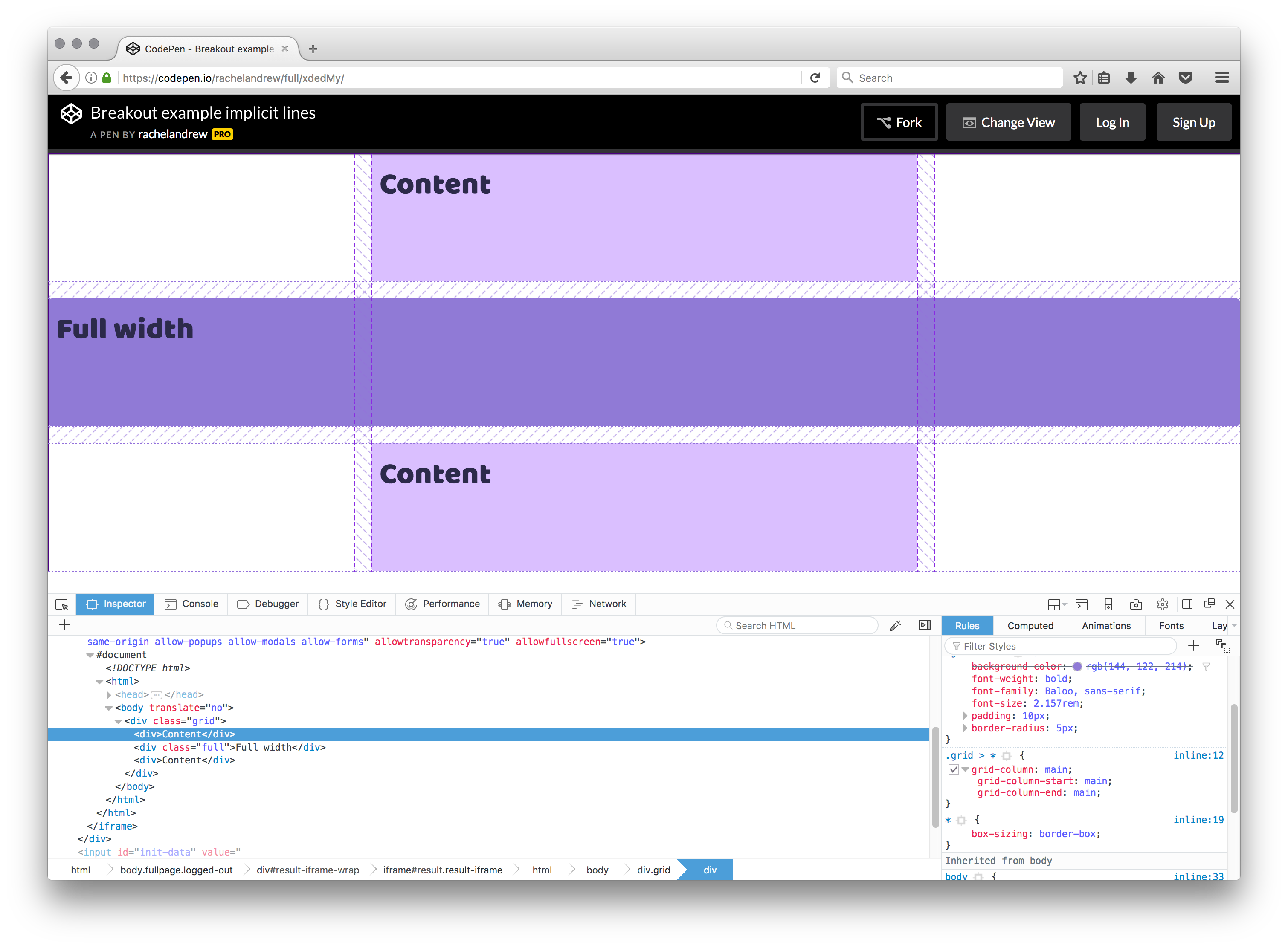
What this demonstrates is that when showing off a nice example it really is worth unpacking how the technique works. There is a lot to know about how line naming works, and by understanding it we can start to use this for more than just one technique.
55 Comments
Explaining a technique for full width elements in constrained columns with CSS Grid #devfestnantes buff.ly/2gQy40V
It is possible to use the IE10/11 version of grid layout as a fallback, more here #devfestnantes buff.ly/2yyPg40
It is possible to use the IE10/11 version of grid layout as a fallback, more here #devfestnantes buff.ly/2yyPg40
A post about CSS Exclusions. I’d really like to have Exclusions support in more browsers buff.ly/2x6Dyuo #devfestnantes https://t.co
Grid Fallbacks and Overrides – using grid to overwrite older methods buff.ly/2ytgwyM
More on why CSS Grid isn’t Masonry buff.ly/2yRtnik #DevFest17 #gdglondon
Explaining an interesting technique “Breaking out with CSS Grid Layout explained” buff.ly/2mh5Yks #DevFest17 #gdglondon https://t.co
Good morning @rachelandrew! Just wanted to thank you for your new CSS grids book. I thought I understood CSS layout pretty well, but even the sections on the old stuff were illuminating. Looking forward to using it all.
Oh wow – love this technique – thank you!
@kleinfreund @wesbos @smashingmag I explain that very specific technique here rachelandrew.co.uk/archives/2017/… (the Smashing post gets into all the
Using CSS Grid: Supporting browsers without grid by @rachelandrew ow.ly/JxLC30gEd5U via @smashingmag #CSS #CSSGrid #webdev
Some great tips from @rachelandrew on how to use #CSS Grid while supporting older browsers – ow.ly/OyR830gE1zc #webdev