Recently implemented in Chrome are two of my top asks for CSS—the concept of rows in multiple-column layout, and gap decorations for rows and columns in grid, flexbox, and multicol. Rows (using column-wrap) provide a way to use multicol on the web without risking scrolling up and down to read if the columns become taller than the viewport. Gap decorations mean that, for multicol, you can now add a rule between these new rows. This post is a collection of the things I think would be interesting to do in future. If you think so too, and particularly if you have a great use case for any of these, let me know in the comments.
This demo shows wrapped columns with row gap decorations. At the time of writing it works in Chrome and Edge.
This demo uses column-span for the heading. It’s part of the multicol container on the <article> so included in the column-height that makes the height of the row. The demo also uses row-rule to make it clearer that the reading flow is across the columns before moving down to the next screen of columns.
A page full of columns creates a reading experience like you might see in a print publication. As such, it would be nice to make this feel more page-like, by snapping the scroll to the next page as you scroll down. There currently isn’t a ::row pseudo-element defined, so this isn’t possible. I created an issue to add one, as I think this is a natural addition now that we can create a page full of columns.
Floating things in columns
The reason for many multicol limitations is that column boxes, and the new row boxes, aren’t a container in the way that a flex or grid item is. There’s no element, so you can’t change the background of a column or row, or add padding to them. The ::column pseudo-element that’s part of the multicol level 2 specification, only accepts the scroll-margin, scroll-snap-align, and scroll-snap-stop properties.
You also can’t control the position of floated elements inside columns, something that’s very common in print column layouts. For example, you can float an element in a multiple column layout. If it’s the first item on the page it appears in the first column and floats left or right within the bounds of that column. There’s no way to float it at the right side of column two, or at the bottom of a column.
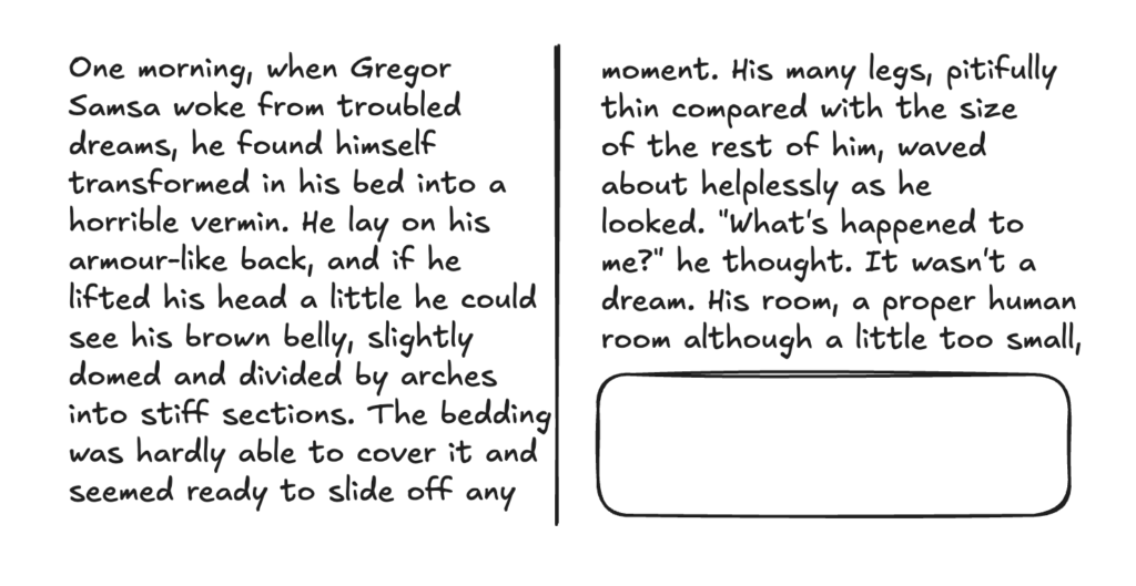
You can place it further down in the content and hope it ends up in the second column, but there’s no control. The float is constrained inside the column it happens to end up in when it’s laid out. This makes sense when you understand that content in a multicol container is fragmented in the same way content in a printed document is, each column is essentially a page. If you printed a documented with a floated element in, you’d expect it to float left or right from its natural position.
In printed layouts however, you often see a boxout or image floated to the top or bottom of a particular column (or page), and it’s something that makes sense on the web now we have a way to wrap columns. There is a specification for this already—CSS Page Floats. The specification needs work, and would need use cases to convince anyone to implement it, but the concept exists. Earlier this year, there was a lot of discussion around Pretext, a layout engine, and people were excited about some of the demos with content flowing around floated elements. Page floats could get us some of the way to this, along with Exclusions which would enable common print designs such as an element floated in the middle of two columns.
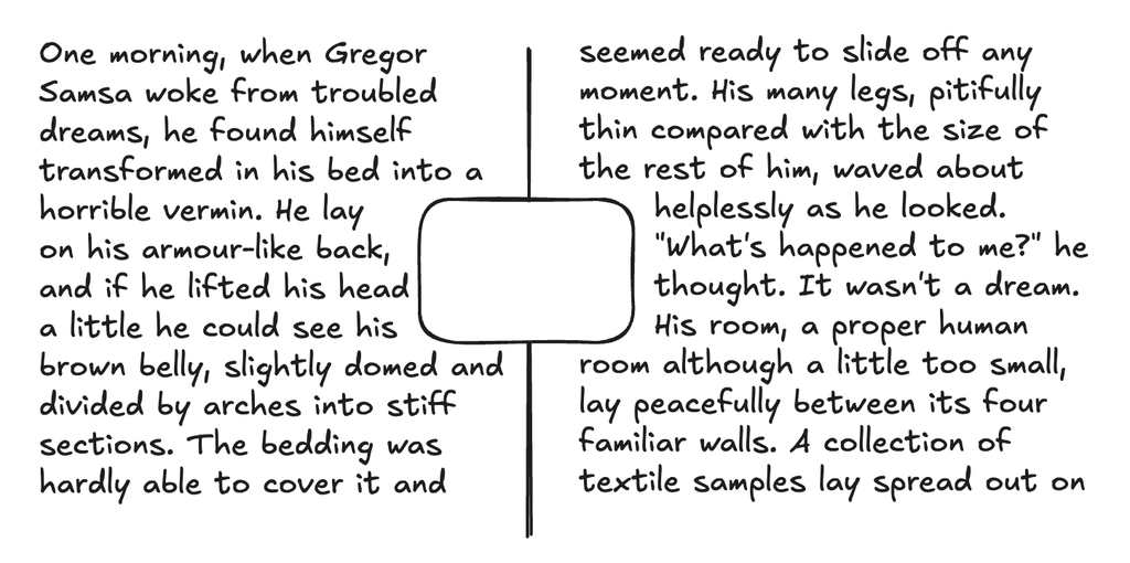
Even if the web use cases for the features are limited, it would be amazing to have them in the browser to use when printing (or creating PDFs). The print user agents, such as Prince, have already implemented page floats, with their own extensions to the specification. Creating print-ready documents from the browser is incredibly common, and still difficult, despite the existence of specifications for this use case.
column-span: <integer>
Multicol is a pretty straightforward specification, until you start thinking about spanners. A spanner is an element that spans across all of the columns, creating a set of column boxes above and below that element. The majority of tricky issues in specifying multicol arise from these spanners in the works. In the level two specification is a rough draft for spanners that span some, but not all, columns. I’m not sure how much of a use case there is for this, given the additional complexity. I would love to know if there are compelling cases, particularly on the web.
Multicol and fragmentation issues
When I write about multicol, a lot of the issues people tell me about aren’t really part of the specification at all, but you only see them when using multicol. As previously explained, multicol behaves in the same way as a document split into pages when printed. We describe it as fragmenting, each column or page becoming a fragment of the complete element. When you fragment things, you end up with problems such as headings ending up as the last thing in a column or page. The CSS Fragmentation specification provides ways to deal with these situations, however it’s poorly implemented across browsers. To learn more about why this is so hard, read this deep dive into block fragmentation in LayoutNG. If you are encountering fragmentation issues, it’s worth raising them with browsers (or finding the existing, likely elderly, bug and starring it.)
More reading
I’ve written about multicol and related specifications a number of times, as have other people. Some of those follow. Let me know your web or print use cases!
- When And How To Use CSS Multi-Column Layout (Smashing Magazine, 2019)
- Breaking Boxes With CSS Fragmentation (Smashing Magazine, 2019)
- Things We Can’t (Yet) Do In CSS (Smashing Magazine, 2019)
- Revisiting CSS Multi-Column Layout (Andy Clarke, CSS Tricks, 2025)
- Multicol and Fragmentation (Video, CSS Day 2025)
- Thinking about page floats, figures, regions and grids (2016)
4 Comments
Finally! 🎉
Multi-column layout that ensures columns never require scrolling (writing goes from col 1 to col 2, they always fit the vertical viewport). Very, very cool. @rachelandrew shows you how https://rachelandrew.co.uk/archives/2026/08/24/multiple-column-layout-rows-rules-and-floats/
I’m so incredibly excited for more css columns support and functionality! I’ve been wanting these features for so many years. Thank you @rachelandrew
https://rachelandrew.co.uk/archives/2026/08/24/multiple-column-layout-rows-rules-and-floats/
Multiple-Column Layout, Rows, Rules, and Floats, by @rachelandrew:
https://rachelandrew.co.uk/archives/2026/08/24/multiple-column-layout-rows-rules-and-floats/?ref=frontenddogma.com
#css #layout #floats
css
floats
layout
1 Trackback or Pingback
Likes
Mentions
Reposts